Spring 2011
Why did Helvetica eventually trump all other typefaces?
– Sara Sklaroff
What is so ubiquitous that it barely registers in the mass consciousness while others denounce it as "fascist"? Helvetica.
Here’s a riddle: What is so ubiquitous and generic that it barely registers in the mass consciousness, and yet so objectionable to some that it’s been publicly denounced as “fascist” and, simply, “crap”?
The answer is the typeface Helvetica. Created in 1957 by two Swiss typographers, it is both a modernist icon and a workhorse default, at once retro and still in heavy use. It’s not derided in quite the same terms as typefaces such as Papyrus (think of those hideous Avatar subtitles) or—heaven forfend—the goofy script of Comic Sans. Still, to some graphic designers Helvetica is emblematic of crushing conformity, or, at the very least, a pitiful lack of creativity. American Apparel, Gap, and Crate & Barrel use it to hawk their wares—it has long been a favorite of corporations trying to seem friendly or down-to-earth. To others, Helvetica is typographic perfection, infinitely flexible and exquisitely modern, with a gorgeous interplay of positive and negative space.
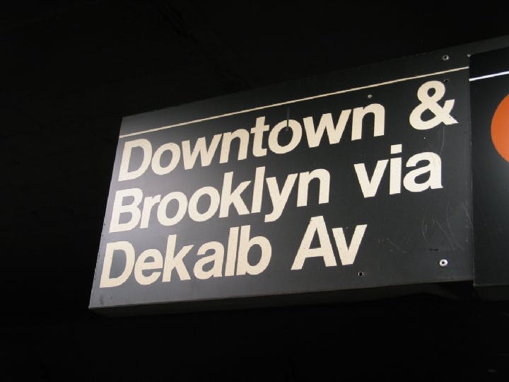
This tension among the typeface’s many meanings was one of the themes of Gary Hustwit’s excellent 2007 documentary Helvetica, which featured many shots of New York City subway signage. But as design historian Paul Shaw explains in Helvetica and the New York Subway System, Helvetica has not always been the face of the city’s underground rail. Shaw delves into the question of why Standard, the typeface used in the 1960s modernization of the system’s graphics, was replaced by the very similar Helvetica. The book is also a concise history of the New York subway, a visual archive of a century’s worth of underground signs (some of which are still in use), and an impressive study of the conflict between the purity of design and the messiness of the real world.
New York City’s first subway line was opened by a private company in 1904. It soon had a rival; neither included the other’s routes on its maps. In 1940, the city bought both systems and merged them with its own. The new system inherited the visual noise of all three: painted terracotta lettering, mosaic station names, porcelain enamel directional signs, and hand-lettered service notices, with no standardization whatsoever.
In 1957, New York designer George Salomon sent the city an unsolicited proposal for an integrated (and quite fetching) signage system based on the elegant sans serif typeface Futura and some unmissable fat directional arrows.
The city declined to use the overall plan, but adopted Salomon’s color-coded route map, the first to show the entire subway system at once. This would be the pattern for years to come: an acknowledgment that something had to be done about the chaos, but a lack of the wherewithal (money, political weight, courage) to see a comprehensive plan through. During the 1960s, cities such as Milan, London, and Boston redesigned their airport and subway graphics, and New York attempted to follow suit by hiring the design firm Unimark International and beginning an overhaul using the Standard typeface. But the unmanageable sprawl of the subway system—not to mention the city’s financial troubles in the early 1970s—thwarted designers’ best intentions. The only aesthetic constant was an altogether different kind of signage: graffiti.
By the 1990s, however, Helvetica was everywhere. Why did it eventually trump all other typefaces? In large part because it is the ultimate default choice. Shaw lists the various letter-making equipment catalogued in the 1989 MTA Sign Manual, including machines used to produce digital type, phototype, and computer-based letters and stencils. “The only typeface that was available for all of these systems and methods,” he writes, “was Helvetica.”
At the same time that advancing technology assured Helvetica’s fate in New York, the personal computer was bringing the typeface to a far wider audience. The masses now possess the means of typographic production, but there’s no guarantee that good design will follow. Helvetica can indeed be a thing of beauty, but only in the right hands.
* * *
Sara Sklaroff is the editorial director of Diabetes Forecast.
Cover photo courtesy of Flickr/jshyun
